
Compliance .ai
Regulations Library and Tracker. UX Research + UX Design
Summary
& End Results
BACKGROUND
Compliance.ai (Previously called Jurispect), unifies the landscape of compliance regulation into a single digital product with A.I. compliancy insight. This was the idea at least. The company had collected a large number of documents and data scientists, but as yet the organization of those documents or the interface to access them had not been created. This would be my role.
OUTCOME
Starting with low-fidelity prototypes, user testing, and interviews with field experts, we quickly iterated from our first concepts, developing better prototypes to growing in about understanding of the space. A key moment was pausing development to synthesize our collected data into clear user needs. The resulting design principles and allowed us to shift our focus and prioritize a design that people would trust and feel familiar with. Because of these changes, our final design was a complete success.
My Role:
UX Designer
Researcher
My Team
2 Engineers,
2 Data scientists
1 Product Manger
My Tools
Sketch, Invision
Adobe Suite
My Timeline:
12 weeks
Complete Story
& Design Process
Problem and Needs
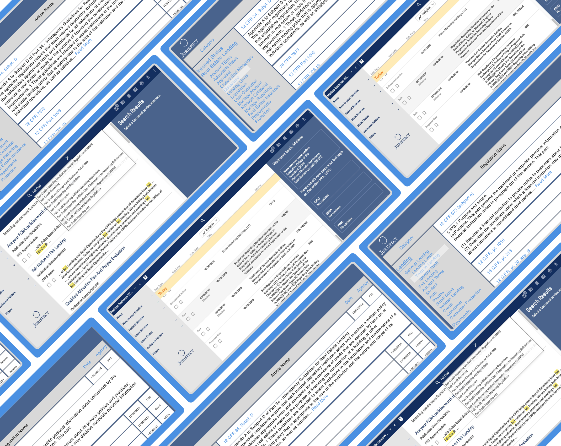
Through months of web scraping, the data team had collected a mountain of documents users would eventually access. However, there was no organization or planned digital layout. The problem was how to display over a million documents and updates in a way that’s accurate, useful, and inspires trust.
The Process
Exploring the Problem
User testing with and learning
Prior to beginning any interface design, the team had collected millions of unsorted regulation documents. However, we had no information architecture for this data or a design for how users would access it. To begin to understand these two problems we started developing low-fidelity prototypes and testing with users.

As we suspected, these first low fidelity prototypes revealed that user's mental maps rarely agreed with our tagging system. However, we learned that a critical concern of our users was feeling familiar with the layout, specifically, it needed to look like the federal website and document they were used to browsing. Without this, users didn’t know how to navigate and even worse, didn’t trust the app to give them the right documents.
Focus Insights
Apply what we learned and beginning to iterate
1st Focus Insights + Prototype
Next, we shifted our focus to understanding the experts. Some of our primary focuses were on compliance officers and regulatory officials. After three months of recruiting and interviews, we designed a second and much more complete prototype. Armed with a better understanding of the space and user’s expectations, we went back to testing. Most importantly, this version offered an organization that was similar to many other legal document hierarchies.
Despite the changes, users still disagreed with our information hierarchy. While we were correct to focus on expert feedback to understand user expectations, we were wrong to assume anyone way of organizing would meet the needs of multiple users.
Re-Focus Insights
With two prototypes and plenty of user feedback, we took a moment to review our assumptions, results, and potential solutions so far. Organizing this data into a series of updated journey maps and user values, we worked with the team to finalize design options, business/user's needs, and to get buy-in across the company for the next steps in design.
Some of the essential takeaways from this session were:
Trustworthy and Familiar
The organization of documents needed to feel familiar and look trustworthy
Design for Customization
Each user had a different way of looking at the landscape, and none were more "right" or more "wrong"
Easily Searchable
Individual documents had to be easy to find by name and filing number
Prototype
The final build and test
To begin our new design solution, we looked at how to give the experience of familiarity. Across experts and regular users, the only thing all had in common was a reliance on Google Alerts. While initially, we only saw this as product validation, our new insights into familiarity meant that if our interface echoed Gmail it could meet almost all our user’s needs. Next, we looked to establish trust by organizing all documents using the hierarchies of their original sources (FDC, SEC, etc.). By mirroring the sources closely, we added an essential element of truth nearly beyond reproach.


Finally, we added a suggestive search and a personalized folder for users to bookmark items and receive specific updates about bookmarked documents.

Ship
Putting it all together
With this final design, users praised the ease-of-use and the new layout as a considerable improvement from previous prototypes and their existing tools. The final product was released with small tweaks, but our initial design remained remarkably effective as a solution. While light on features, it flawlessly gave users the ease of access they were looking for and quickly became their singular source of regulation info.
Outcomes
Learnings and Final Takeaways
Compliance.ai’s regulation tool was able to move from an unorganized idea to software that allowed navigation through millions of documents. By frequently testing, learning from mistakes, and working with users, we created:
Proved Value
Showed the value of prototyping early and iterating by launching a project that didn’t disrupt users and resulted in only positive feedback
A Novel Solution
The solution brought a unique idea to the world of Legal Tech and brought together the efforts of both human interests and technological futurism
MVP Released
Successfully brought an idea from an initial thought all the way to an initial product offering